top of page

MyAnimeList Design Evaluation
Redesigning the Review Process of MyAnimeList
Role
Course
Interaction Designer, UX Researcher, and A/B Tester
IAT432 - Design Evaluation
Tools
Duration
Figma
4 Weeks
Overview
MyAnimeList (MAL) is an online platform that serves anime and manga enthusiasts. Users can maintain personal lists, explore recommendations, and contribute reviews to help others discover new shows.

Through a heuristic evaluation, we identified that MyAnimeList’s review system was overly complex, often leading to user frustration and disengagement.
Problem
Our Goals
Our aim is to refine MyAnimeList’s current review system to enhance user satisfaction and maintain the site reputation as the go-to platform for anime and manga fans.
Research
Our research and planning is split into Phase 1 & Phase 2. For the 1st Phase, we worked collectively to find the overall main issues of MyAnimeList. After identifying the main issues, we initially planned to redesign the whole MyAnimeList website into a modern and updated interface that would allow for easier navigation

Heavy Visual Load - Outdated Design

Limited Filtering System
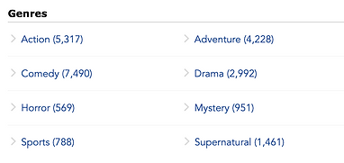
Genres can’t be combined for a more specific search
Based on project scope refinement, it would not be realistic to complete the redesign of MyAnimeList in 4 weeks. Therefore, we decided to re-do our research and focus on redesigning the issues that we found. Therefore, for the 2nd Phase, we decided to do a comparative usability testing between MyAnimeList and its competitor to get a better picture of what MyAnimeList is doing well or isn’t doing well.


From this test, after gathering the user’s feedback on ease of use, visual appeal, and task flow from the pre and post test questionnaires. It revealed key usability and visual design issues in MyAnimeList, as well as strengths from the competitor that could inform our ideas. From there, we found another issue for MyAnimeList which would be their review process

-
Phase 1
-
Phase 2
Solutions
Our solution for MyAnimeList is spanned between Phase 3 and Phase 4. For the 3rd Phase, we created two prototypes for how we want MyAnimeList to look like based on the research that we have done.
For the purpose of this project and due to the time limitation that we had. We decided to focus on refining MyAnimeList’s complex review system as well as simplifying the website into a more modern design and less visual load, to have a clear user flow for the review process.
Provided below is the video prototype of both prototypes, where we implemented a simplified home page, clear buttons, and consistent visual elements for both prototypes.
-
Phase 3
1st Prototype - Focused on written review with optional category based review under advanced settings
2nd Prototype - Focused on category based review with optional written review under advanced settings
-
Phase 4
For the 4th Phase, we decided to create another A/B/C testing between both of the prototypes as well as the original MyAnimeList website design to really see which one would be the better solution for refining MyAnimeList’s complex review system.

Results
From these results, we proposed Prototype 1 as the solution for further implementation to refine MyAnimeList’s comlex review system due to its stronger visual appeal and user satisfaction. Prototype 1 effectively addresses the cluttered interface issues on the original website design, offering a cleaner design with intuitive button placements. The straightforward review process is more efficient and provides users with the right level of freedom.
Reflection
This project taught me how data-driven testing and iterative evaluation can guide impactful design decisions. By narrowing scope and refining based on evidence, our team produced a more meaningful redesign that directly improved the user experience.
If given more time, I would expand the redesign to include other usability issues discovered during testing, such as improving the genre filtering and enhancing community interaction features.
Summary of the A/B/C testing results:
Prototype 2
-
Highest Ease of Locating Reviews (M = 4.83)
-
Fewest Errors (M = 2.67)
-
Least Redundant Clicks
Prototype 1
-
Highest Visual Appeal (M = 4.83)
-
Most Efficient from Completion Time (M = 3m 29s)
-
Highest Satisfaction Levels (M = 4.17)
bottom of page